tableau TDS-C01 Exam Questions
Questions for the TDS-C01 were updated on : Feb 20 ,2026
Page 1 out of 22. Viewing questions 1-15 out of 317
Question 1
Which two statements accurately describe a visualization animation? Choose two
- A. Highlights changing patterns in data
- B. Can be simultaneous or sequential
- C. Can be applied to map visualizations
- D. Uses the Pages shelf
Answer:
A, B
Explanation:
Visualization animations in Tableau can highlight changing patterns in data and can be either
simultaneous or sequential:
A . Highlights changing patterns in data:
Visualization animations are designed to highlight changes in data over time or as filters are applied.
They help users to see how data trends and patterns evolve.
B . Can be simultaneous or sequential:
Animations in Tableau can be configured to play simultaneously or sequentially. Simultaneous
animations play all changes at once, while sequential animations play changes one after the other,
allowing for a step-by-step view of data transformations.
Incorrect options:
C . Can be applied to map visualizations: While animations can be applied to map visualizations, the
statement is not one of the two correct descriptions of visualization animations as per the question
context.
D . Uses the Pages shelf: The Pages shelf is used for creating page animations, which is a different
concept from visualization animations.
Reference:
Tableau's official documentation on animations:
Formatting Animations
Question 2
Which three statements accurately describe continuous fields? Choose three.
- A. Continuous fields appear as green pills.
- B. Continuous fields are numeric.
- C. The values in continuous fields are treated as an infinite range.
- D. Continuous fields are categorical
- E. Only measures can appear as continuous.
Answer:
A, B, C
Explanation:
Continuous fields in Tableau have specific characteristics:
A . Continuous fields appear as green pills:
Continuous fields in Tableau are represented as green pills in the view. This indicates that they are
treated as a continuous range of values rather than discrete categories.
B . Continuous fields are numeric:
Continuous fields typically consist of numeric data that can take any value within a range. They are
used to measure and compare data values.
C . The values in continuous fields are treated as an infinite range:
Continuous fields are treated as an infinite range, allowing for detailed and granular analysis of data.
Unlike discrete fields, which are considered distinct and separate, continuous fields are seen as a
seamless continuum.
Incorrect options:
D . Continuous fields are categorical: This is incorrect because categorical fields are discrete, not
continuous.
E . Only measures can appear as continuous: This is incorrect because dimensions can also be treated
as continuous in certain contexts.
Reference:
Tableau's official documentation on continuous and discrete fields: Continuous and Discrete
Question 3
You create a dashboard that tracks your teams progress on various projects. On the dashboard, you
want to display your company's web page. Which dashboard element should you use?
- A. A navigation object
- B. A URL action
- C. An extension
- D. A web page object
Answer:
D
Explanation:
To display your company's web page on a Tableau dashboard, you should use a web page object. The
web page object allows you to embed a web page within your Tableau dashboard, providing direct
access to external web content.
Open your Dashboard: Start by opening the dashboard where you want to add the web page.
Add Web Page Object: In the Objects section of the dashboard pane, select the "Web Page" object
and drag it onto your dashboard.
Configure URL: After placing the web page object, a dialog box will prompt you to enter the URL of
the web page you want to display. Enter your company's web page URL here.
Resize and Position: Adjust the size and position of the web page object to fit your dashboard design.
Reference:
Tableau's official documentation on dashboard objects:
Dashboard Objects
Question 4
Which two filter modes can you use with dimension filters? Choose two
- A. Multiple Values (drop-down)
- B. At most
- C. Wildcard Match
- D. Range of Values
Answer:
AC
Explanation:
With dimension filters in Tableau, you can use several filter modes, including "Multiple Values (drop-
down)" which allows users to select one or more values from a drop-down list of all the dimension's
members. Another mode is "Wildcard Match," which lets users filter the view by typing in a text box
to match dimension members that contain the typed string. These filter types are particularly useful
for string or categorical dimensions where users need to search or select specific members to display
in the view.
Question 5
The option to create bins is available for which type of field?
- A. Boolean
- B. String
- C. Date
- D. Numeric
Answer:
D
Explanation:
The option to create bins in Tableau is available for numeric fields. Bins allow you to group a series of
numeric values into larger segments, which can simplify analysis and help in creating histograms or
other visualizations that show the distribution of data. For example, you can create bins to group
ages into categories like 0-10, 11-20, etc.
Question 6
What two methods can you use to change the font of a worksheet title? Choose two.
- A. Double-click the title in a particular view and use the dialog box.
- B. Right-click the title in a view, and then select Format Title.
- C. Select Format on the menu, and then select Font.
- D. Select Format on the menu, and then select Title and Caption.
Answer:
A, D
Explanation:
In Tableau, you can change the font of a worksheet title by double-clicking directly on the title in the
view, which opens a dialog box where you can format the text, including changing the font. Another
method is to use the Format menu; from there, you select "Title and Caption," which opens the
Format Title pane on the left side of the screen, where you can change the font and other formatting
options for the worksheet title.
Question 7
You have a visualization that uses multiple types of sorting.
How can you clear all sorting of the visualization?
- A. Right-click a sorted field, and then select Clear Sort.
- B. From the Dashboard menu, select Clear.
- C. From the Header label, select the sort icon.
- D. From the Worksheet menu, select Clear, and then select Sorts.
Answer:
D
Explanation:
To clear all sorting in a Tableau visualization, you would go to the Worksheet menu, select the "Clear"
option, and then choose "Sorts." This action removes all sorting that has been applied to the
visualization, including any custom sorting or sorting based on multiple fields. This is a quick way to
reset the view to its default sorting state and is particularly useful when you have applied various
sorting layers and wish to start fresh.
Question 8
You view the relationship canvas shown in the following exhibit.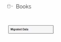
What does Migrated Data indicate?
- A. The workbook was created in previous version of Tableau Desktop.
- B. The data was imported from Tableau Server.
- C. The data was recently saved as a packaged data source.
- D. The workbook was downloaded from Tableau Online.
Answer:
A
Explanation:
In the context of Tableau, "Migrated Data" typically refers to data or workbooks that have been
upgraded from a previous version of Tableau Desktop. When you open a workbook in a newer
version of Tableau, the data sources within that workbook might be labeled as "Migrated Data,"
indicating that they have undergone a conversion process to be compatible with the new version's
features and architecture.
Question 9
You create a visualization by first adding a measure to rows. Next, you add a dimension wilh 11
members to columns.
Assuming that all the dimensions have a non-zero value, how many marks are in the view before and
after the dimension is added?
- A. 1 before and 2 after
- B. 1 before and 12 after
- C. 1 before and 11 after
- D. 2 before and 11 after
Answer:
C
Explanation:
In Tableau, when you initially add a measure to the rows shelf, you create one mark in the view that
represents the aggregate value of that measure. When you then add a dimension with 11 members
to the columns shelf, the view is subdivided into 11 separate marks, each representing the measure
for one of the dimension members. This results in a total of 11 marks in the view after the dimension
is added, one for each member of the dimension.
Question 10
You want to save a view as an image that you can paste into a Microsoft Word document. Which two
statements accurately describe exporting a view as an image? Choose two.
- A. Default exports include everything in the view, including Tableau fonts.
- B. The default export format is TIFF.
- C. The default export format is PNG.
- D. The exported image is a vector-based file that embeds the Tableau fonts.
Answer:
A, D
Explanation:
When exporting a view as an image in Tableau, the default export includes everything that is
currently displayed in the view, with Tableau applying its own styling, including fonts. The default
format for an exported image is PNG, which is a raster-based file format that captures all visual
elements as pixels. PNG is widely used for its lossless compression and is suitable for detailed images
like those produced by Tableau. Unlike vector-based images, PNGs do not embed fonts, and the
image quality remains consistent when the image is viewed on different platforms, which makes it
ideal for inserting into documents like Microsoft Word.
Question 11
Which two analytics options are available for a scatter plot view? Choose two.
- A. Forecast
- B. Totals IS
- C. Reference lines
- D. Trend lines
Answer:
C, D
Explanation:
For a scatter plot view in Tableau, you can add reference lines and trend lines as part of the analytics
options. Reference lines can be added to a visualization to mark certain values or to provide context,
such as an average line across a scatter plot. Trend lines, on the other hand, are used to show the
relationship between two variables in the view, indicating the general direction or pattern of the data
points in a scatter plot.
Question 12
What are two methods for renaming a field in a visualization? Choose two.
- A. From the Data pane, click and hold on the field until the name is editable.
- B. From the Data pane, use the field's drop-down menu and select Rename.
- C. From the Format menu, select Field Labels.
- D. From the Data pane, right-click the field and select Replace Reference.
Answer:
A, B
Explanation:
In Tableau, you can rename a field directly in the Data pane by clicking and holding on the field name
until it becomes editable, allowing you to type a new name. Alternatively, you can use the drop-
down menu associated with the field in the Data pane and select the "Rename" option. Both
methods provide a quick and easy way to change the name of a field without affecting the underlying
data structure. The "Format menu" and "Replace Reference" option do not apply to renaming fields.
Question 13
Which three statements accurately describes the capabilities of dashboard actions? Choose three.
- A. Can be set to dynamically update when a workbook opens
- B. Can be set to Filter, Highlight, or Go to URL
- C. Can be set to run on Hover, Select, or Menu
- D. Can be set to be triggered on a data value
- E. Can have multiple source and target sheets
Answer:
B, C, E
Explanation:
Dashboard actions in Tableau are interactive elements that can be used to create a more dynamic
experience. These actions can be set to filter data on the dashboard, highlight specific elements, or
even direct the user to a URL when interacting with a visualization. They can be triggered by user
interaction such as hover, selection, or accessing a context menu. Moreover, dashboard actions can
have multiple source sheets (where the action originates) and target sheets (where the action takes
effect), allowing for a complex interactivity between different parts of the dashboard.
Question 14
You want to provide additional information when hovering over a field in the Data pane as shown in
the following exhibit.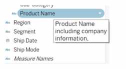
What should you configure for the field?
- A. An alias
- B. A header label
- C. A hierarchy
- D. A default comment
Answer:
D
Explanation:
To provide additional information when hovering over a field in the Data pane, as shown in the
exhibit, you need to configure a default comment for the field. This comment can be set by right-
clicking on the field in the Data pane and selecting "Default Properties" and then "Comment." The
text entered as a comment here will then be displayed as a tooltip when hovering over the field in
the Data pane.
Question 15
What are two use cases for creating hierarchies from the Data pane? Choose two.
- A. To organize related fields together
- B. To create faster-performing queries
- C. To concatenate all fields into a single field
- D. To add drilldown functionality for fields
Answer:
A, D
Explanation:
Hierarchies in Tableau are used to define a drill-down path through your data. By creating a
hierarchy, you can organize related fields together, which makes it easier to navigate complex data
models. This also allows users to explore data at different levels of detail, from the highest level of
the hierarchy to the most granular details, simply by clicking to expand and collapse levels of the
hierarchy in the view.