tableau TCC-C01 Exam Questions
Questions for the TCC-C01 were updated on : Feb 20 ,2026
Page 1 out of 4. Viewing questions 1-15 out of 55
Question 1
A client is searching for ways to curate and document data in order to obtain data lineage. The client
has a data source connected to a data lake.
Which tool should the consultant recommend to meet the client's requirements?
- A. Tableau Catalog without Tableau Data Management Add-on
- B. Tableau Catalog with Tableau Data Management Add-on
- C. Tableau Prep Conductor
- D. Tableau Catalog with Tableau Server Management Add-on
Answer:
B
Explanation:
To effectively curate and document data for obtaining data lineage, particularly from a data source
connected to a data lake, the recommended tool is:
Tableau Catalog with Tableau Data Management Add-on: This add-on enhances the capabilities of
Tableau Catalog, providing extensive features for data management, including detailed data lineage,
impact analysis, and metadata management.
Functionality: The Tableau Catalog with the Data Management Add-on allows users to see the full
history and lineage of the data, trace its usage across all Tableau content, and understand
dependencies. It also facilitates better governance and transparency in data handling.
Why Choose this Tool: For a client needing comprehensive data lineage and documentation
capabilities, this add-on ensures that data stewards and users can maintain and utilize a well-
managed data environment. It supports robust data governance practices necessary for large and
complex data ecosystems like those typically associated with data lakes.
Reference
The recommendation is based on the functionalities offered by the Tableau Data Management Add-
on, as described in Tableau's official documentation on managing and documenting data sources for
enhanced governance and operational efficiency.
Question 2
A company has a sales team that is segmented by territory. The team's manager wants to make sure
each sales representative can see only data relevant to
that representative's territory in the team Sales Dashboard.
The team is large and has high turnover, and the manager wants the mechanism for restricting data
access to be as automated as possible. However, the
team does not have a Tableau Data Management license.
What should the consultant recommend to meet the company's requirements?
- A. Create one group for each territory and assign sales representatives to the appropriate groups. Map each group to a territory in the Sales Dashboard. Publish this dashboard to the Sales Dashboard project and ensure all users have permissions to view the dashboard.
- B. Create separate workbooks for each territory. Publish each dashboard to the same Sales Dashboard project, and set permissions so each sales representative can see only the dashboards for their territories.
- C. Create a data source by joining the sales data table to an entitlements data table. Add a data source filter to restrict access and publish the data source. Connect the Sales Dashboard to this published data source.
- D. Create a user filter in the Sales Dashboard workbook and map each sales representative to the territories they are responsible for. Publish this dashboard to the Sales Dashboard project and ensure all users have permissions to view the dashboard.
Answer:
C
Explanation:
To ensure that each sales representative sees only data relevant to their territory, the best approach
in the absence of a Tableau Data Management license involves using a joined data source with
entitlements:
Data Source Configuration: Create a data source that joins the sales data table with an entitlements
table. The entitlements table contains mappings of sales representatives to their respective
territories.
Data Source Filter: Implement a data source filter that restricts data based on the current user’s
access rights. This filter references the joined entitlements to dynamically control data visibility
based on the logged-in user.
Publishing the Data Source: Publish this filtered data source to Tableau Server. All workbooks or
dashboards connecting to this data source inherently respect the row-level security established by
the data source filter.
Reference
This approach aligns with Tableau’s capabilities for implementing row-level security directly within
the data source, as detailed in the Tableau security management and data modeling best practices.
Question 3
A multi-national company wants to have a Tableau dashboard that will provide country-level
information for both its forecast summaries and year-on-year
metrics. The company wants to toggle between these two views while leaving main key performance
indicators (KPIs) visible on the main dashboard.
Which method is the most efficient in achieving the company's requirements?
- A. Create a dashboard with the sheets containing the main KPIs and the forecast summary worksheet. . Duplicate this dashboard and replace the forecast view worksheet with the year-on-year metrics worksheet. . Add navigation buttons to both dashboards.
- B. Create a parameter that accepts values from a list that contains "Forecast View" and "Year-on-Year View." . Right-click the parameter and select Add to Sheet for both worksheets. . Navigate back to the dashboard and to the upper corner of the two worksheets. . Enable the Use as Filter option.
- C. Create a single worksheet with all the measures required for both the forecast summary and the year-on-year views. . Create a Boolean parameter and a corresponding calculated field with the following calculation: True. . Add a blank dashboard object and in the Layout tab, check the box for "Control visibility using value" and select the parameter you created.
- D. Create a Boolean parameter with the two names of the views as aliases and a corresponding calculated field with the following calculation: True. . Add the forecast summary sheet to the dashboard and add the year-on-year metrics sheet to the same dashboard as a Floating dashboard object. . Add the calculated fields as a Detail under the Marks card of the floating view, create a "Change Parameter" action, and set the "Target Parameter" and "Source Fields" to the parameter and calculated field you created. . Check the box for "Control visibility using value" in the Layout tab of the floating view and select the parameter you created.
Answer:
D
Explanation:
The most efficient method for toggling between two views (forecast summaries and year-on-year
metrics) while keeping main KPIs visible involves using a parameter and calculated fields for
controlling visibility:
Create a Boolean Parameter: This parameter will have two aliases representing the two views
("Forecast View" and "Year-on-Year View"). This allows the user to select which view they wish to see
directly from the dashboard.
Calculated Field: Create a calculated field that always returns True. This field acts as a constant
placeholder to enable the visibility control tied to the parameter.
Dashboard Setup: Place both the forecast summary and the year-on-year metrics sheets on the
dashboard. Set the year-on-year metrics sheet as a floating object over the forecast summary.
Visibility Control: Use the "Control visibility using value" option in the Layout tab for the floating
year-on-year metrics view. Tie this setting to the Boolean parameter so that changing the parameter
will show or hide this view without affecting the main KPIs displayed on the dashboard.
Interactivity: Implement a "Change Parameter" dashboard action where selecting different options in
the dashboard (e.g., clicking on certain parts) triggers the parameter to change, thus toggling the
visible view.
Reference
This method leverages Tableau's dashboard interactivity features including parameters, calculated
fields, and visibility settings, as recommended in Tableau’s user guide on dynamic dashboard design.
Question 4
A client has several long-term shipping contracts with different vendors that set rates based on
shipping volume and speed. The client requests a dashboard
that allows them to model shipping costs for the next week based on the selected shipping vendor.
Speed for the end user is critical.
Which dashboard building strategy will deliver the desired result?
- A. Recommend that the client model for only profitability for the next 24 hours instead of a full week.
- B. Calculate the potential shipping cost for each order with each vendor, display the aggregate costs in a large table, and use quick filters to limit the options visible to the user.
- C. Aggregate the orders then use a calculated field that refers to a user-selected parameter to calculate the shipping costs.
- D. Use a calculated field that refers to a user-selected parameter to calculate shipping costs for each order and then display the aggregate values.
Answer:
D
Explanation:
For modeling shipping costs based on varying vendor contracts and ensuring speed in dashboard
performance, the suggested approach involves:
Calculated Field with Parameter: Utilize a calculated field that dynamically references a user-selected
parameter for the shipping vendor. This parameter adjusts the cost calculations based on selected
vendor characteristics (like volume and speed).
Aggregate Results: After calculating individual shipping costs, aggregate these costs to provide a
concise, summarized view of potential expenses for the upcoming week. This method ensures the
dashboard remains performant by reducing the load of processing individual line items in real-time.
Why This Works: By using parameters and calculated fields, the dashboard can quickly adapt to user
inputs without needing to re-query the entire dataset. Aggregating the results further improves
performance and user experience by simplifying the output.
Reference
This strategy leverages Tableau's capability to handle dynamic calculations with parameters and is
recommended for scenarios where performance and user-driven interaction are priorities. Tableau’s
performance optimization resources and dashboard design guidelines detail these techniques.
Question 5
A client wants to migrate their Tableau Server to Tableau Cloud. The Tableau Server is configured
with three sites: Finance, Strategy, and Marketing. A
consultant must provide a solution that minimizes user impact and costs.
Which configuration should the consultant recommend for Tableau Cloud to meet the client's
requirements?
- A. One Tableau Cloud instance configured with a Finance project folder, Strategy project folder, and Marketing project folder
- B. One Tableau Cloud instance with two sites for Strategy and Marketing, and one Tableau Server instance for Finance
- C. Three separate Tableau Cloud instances for Finance, Strategy, and Marketing
- D. One Tableau Cloud instance configured with all workbooks in a single project
Answer:
A
Explanation:
To minimize user impact and costs while migrating from Tableau Server to Tableau Cloud with
multiple sites, the best solution is:
Single Tableau Cloud Instance with Multiple Projects: Instead of multiple sites which could imply
higher management overhead and possibly higher costs, configuring one Tableau Cloud instance
with different project folders for each former site (Finance, Strategy, Marketing) is most efficient.
Benefits: This setup maintains organizational separation of data and access similar to having different
sites but leverages the unified management and simplicity of a single cloud instance. It reduces
complexity in user access management and integration points.
Implementation: Each project folder acts like a mini-site within the larger instance, where specific
permissions and content can be managed independently, akin to the original server setup but within
a single cloud-based environment.
Reference
This recommendation is in line with best practices for cloud migration focusing on consolidation and
cost efficiency, as suggested in Tableau’s official documentation for cloud migration strategies.
Question 6
A client wants to count all the distinct orders placed in 2010. They have written the following
calculation, but the result is incorrect.
IF YEAR([Date])=2010 THEN COUNTD ([OrderID]) END
Which calculation will produce the correct result?
- A. IF MIN(YEAR([Date]))=2010 THEN WINDOW_COUNTD([OrderID]) END
- B. IF YEAR([Date])=2010 THEN {COUNTD ([OrderID])} END
- C. COUNTD(IF YEAR([Date])=2010 THEN [OrderID] END)
- D. COUNT(IF YEAR([Date])=2010 THEN [OrderID] END)
Answer:
C
Explanation:
The correct calculation to count all distinct orders placed in 2010 involves placing the conditional
inside the aggregation function, not the other way around. Here's how to correct the client's
calculation:
Original Calculation Issue: The client’s original calculation attempts to apply the COUNTD function
within an IF statement, which does not work as expected because the COUNTD function cannot
conditionally count within the scope of the IF statement.
Correct Calculation: COUNTD(IF YEAR([Date]) = 2010 THEN [OrderID] END). This calculation checks
each order date; if the year is 2010, it returns the OrderID. The COUNTD function then counts all
unique OrderIDs that meet this condition.
Why It Works: This method ensures that each order is first checked for the year condition before
being counted, effectively filtering and counting in one step. It efficiently processes the data by
focusing the distinct count operation only on relevant records.
Reference
This approach is consistent with Tableau's guidance on using conditional logic inside aggregation
functions for accurate and efficient data calculations, as detailed in the Tableau User Guide under
"Aggregations and Calculations".
Question 7
A consultant is designing a dashboard that will be consumed on desktops, tablets, and phones. The
consultant needs to implement a dashboard design that
provides the best user experience across all the platforms.
Which approach should the consultant take to achieve these results?
- A. Build one dashboard that has desktop, tablet, and phone layouts, and fix the size of the layouts.
- B. Build one dashboard and fix the size of the dashboard.
- C. Build one dashboard and set the size to Automatic.
- D. Build one dashboard for each type of device and fix the size of the layouts.
Answer:
A
Explanation:
For a consultant designing a dashboard to be consumed across multiple device types, the best
approach is:
Multi-device Layout: Tableau provides the capability to design device-specific layouts within a single
dashboard. This feature allows the dashboard to adapt its layout to best fit the screen size and
orientation of desktops, tablets, and phones.
Fixed Size Layouts: By fixing the size of each layout, the consultant can ensure that the dashboard
appears consistent and maintains the intended design elements and user experience across devices.
Fixed sizes prevent components from resizing in ways that could disrupt the dashboard’s readability
or functionality.
Implementation: In Tableau, you can create these layouts by selecting 'Device Preview' and adding
custom layouts for each device type. Here, you define the dimensions and the positioning of sheets
and controls tailored to each device's typical viewing mode.
Reference
This approach leverages Tableau’s device designer capabilities, which are specifically designed to
optimize dashboards for multiple viewing environments, ensuring a seamless user experience
regardless of the device used. This functionality is well documented in Tableau’s official guides on
creating and managing device-specific dashboards.
Question 8
A client has a pipeline dashboard that takes a long time to load. The dashboard is connected to only
one large data source that is an extract.
It contains two calculated fields:
. TOTAL([Opportunities])
· SUM([Value])
It also contains two filters:
. A Relative Date filter on Created Date, a Date field containing values from 5 years ago until today
. A Multiple Values (Dropdown) filter on Account Name, a String field containing 1,000 distinct values
A consultant creates a Performance Recording to troubleshoot the issue, and finds out that the
longest-running event is "Executing Query."
Which step should the consultant take to resolve this issue?
- A. Replace the Multiple Values (Dropdown) filter with a Multiple Values (Custom List) filter.
- B. Replace the Relative Date filter with a Multiple Values (Dropdown) filter on YEAR([Created Date]).
- C. Replace the TOTAL([Opportunities]) calculation with a Grand Total.
- D. Replace SUM([Value]) with WINDOW_SUM([Value]).
Answer:
B
Explanation:
To improve the loading time of the pipeline dashboard, which primarily suffers from long query
execution times due to a comprehensive Relative Date filter:
Relative Date Filter Issue: The existing Relative Date filter on "Created Date" covers a broad range (5
years), leading to significant data processing overhead as it includes granular date calculations over a
large dataset.
Optimized Approach: By replacing the Relative Date filter with a Multiple Values (Dropdown) filter
based on YEAR([Created Date]), the filter granularity is reduced. Filtering by year simplifies the query
by limiting the volume of data processed and reducing the complexity of the filter condition.
Implementation Benefit: This approach still provides the flexibility to view data across different years
but does so by reducing the load on the database during query execution, which is critical for
improving the performance of the dashboard.
Reference
This recommendation aligns with Tableau performance optimization strategies, specifically regarding
the management of date filters to minimize their impact on query load, as discussed in Tableau
performance tuning sessions and guides.
Question 9
A client calculates the percent of total sales for a particular region compared to all regions.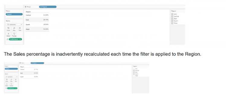
Which calculation will fix the automatic recalculation on the % of total field?
- A. {FIXED [Region]:[Sales]}/{FIXED: SUM([Sales])}
- B. {FIXED [Region]:sum([Sales])}
- C. {FIXED [Region]:sum([Sales])}/{FIXED :SUM([Sales])
- D. {FIXED [Region]:sum([Sales])}/SUM([Sales]}
Answer:
D
Explanation:
To correctly calculate the percent of total sales for a particular region compared to all regions, and to
ensure that the calculation does not get inadvertently recalculated with each region filter
application, the recommended calculation is:
{FIXED [Region]: sum([Sales])}: This part of the formula computes the sum of sales for each region,
regardless of any filters applied to the view. It uses a Level of Detail expression to fix the sum of sales
to each region, ensuring that filtering by regions won't affect the calculated value.
SUM([Sales]): This part computes the total sum of sales across all regions and is recalculated
dynamically based on the filters applied to other parts of the dashboard or worksheet.
Combining the two parts: By dividing the fixed regional sales by the total sales, we get the proportion
of sales for each region as compared to the total. This calculation ensures that while the
denominator adjusts according to filters, the numerator remains fixed for each region, accurately
reflecting the sales percentage without being affected by the region filter directly.
Reference
This calculation follows Tableau’s best practices for using Level of Detail expressions to manage
computation granularity in the presence of dashboard filters, as outlined in the Tableau User Guide
and official Tableau training materials.
Question 10
A client wants to see data for only the last day in a dataset and the last day is always yesterday. The
date is represented with the field Ship Date.
The client is not concerned about the daily refresh results. The volume of data is so large that
performance is their priority. In the future, the client will be able
to move the calculation to the underlying database, but not at this time.
The solution should offer the best performance.
Which approach should the consultant use to produce the desired results?
- A. Filter MONTH/DAY/YEAR on [Ship Date] field and use an option to filter to the latest date value when the workbook opens.
- B. Filter on calculation [Ship Date]=TODAY()-1.
- C. Filter on Ship Date field using the Yesterday option.
- D. Filter on calculation [Ship Date]={MAX([Ship Date])}.
Answer:
B
Explanation:
The best approach to ensure performance while providing data for only the last day (yesterday) in the
dataset is to use a calculated field that filters the data to include only yesterday's date:
Filter on calculation [Ship Date]=TODAY()-1: This calculated field dynamically computes yesterday's
date by subtracting one day from today’s date. This approach ensures that each day, only the data for
the previous day is loaded, which keeps the volume of data minimal and improves performance.
Dynamic Date Calculation: The use of TODAY()-1 ensures the filter remains up-to-date with the
changing dates, without the need for manual updates, providing accuracy and timeliness in the
dashboard.
This approach is efficient because it avoids the overhead of processing the entire dataset and focuses
only on the relevant day’s data. It also aligns with Tableau’s capabilities for creating dynamic filters
using date functions, as highlighted in the Tableau help documentation on date calculations and
filters.
Reference
This solution utilizes Tableau’s built-in date functions and dynamic calculations to optimize
performance, as recommended in Tableau’s performance optimization resources and date
calculation guidelines.
Question 11
A client wants guidance for Creators to build efficient extracts from large data sources.
What are three Tableau best practices that the Creators should use? Choose three.
- A. Keep only the data required for analysis by using extract filters.
- B. Use aggregate data for visible dimensions, whenever possible.
- C. Use only live connections as they are always faster than extracts.
- D. Include all the data from the original data source in the extract.
- E. Hide all unused fields.
Answer:
ABE
Explanation:
To build efficient extracts from large data sources, it is crucial to minimize the load and optimize the
performance of the extracts:
A . Keep only the data required for analysis by using extract filters: This best practice involves using
filters to reduce the volume of data extracted, thus focusing only on the data necessary for analysis.
B . Use aggregate data for visible dimensions, whenever possible: Aggregating data at the time of
extraction reduces the granularity of the data, which can significantly improve performance and
reduce the size of the extract.
E . Hide all unused fields: Removing fields that are not needed for analysis from the extract reduces
the complexity and size of the data model, which in turn enhances performance and speeds up load
times.
These practices are endorsed in Tableau’s official documentation and training sessions as effective
ways to enhance the performance of Tableau extracts and optimize dashboard responsiveness.
Question 12
A client has a dashboard that uses a bar chart to visualize sales by Sub-Category and a detail table
that has all the orders for the products within Sub-
Category. The table has more than 10,000 rows of data and is slow to load.
A consultant plans to add an action so when the client interacts with the bar chart, only the relevant
data appears in the table.
What will provide the fastest rendering of the dashboard?
- A. Add a filter action, set "Run action on" to Select, and set "Clearing the selection will" to Exclude all values.
- B. Add a highlight action and set Target Highlighting to Sub-Category.
- C. Add a highlight action and set Target Highlighting to All Fields.
- D. Add a filter action, set "Run action on" to Menu, and set "Clearing the selection will" to Show all values.
Answer:
A
Explanation:
To optimize the dashboard rendering, particularly when dealing with a large dataset, a filter action is
the most effective tool. Here's why the specified choice is optimal:
Add a filter action: This action creates a direct filter on the detail table based on the selection in the
bar chart. It ensures that only data related to the selected sub-category is loaded into the table,
significantly reducing load time and improving performance.
Set "Run action on" to Select: This setting means the filter action will be triggered as soon as the user
selects a bar in the bar chart. Immediate activation of the filter ensures that the dashboard is
interactive and responsive.
Set "Clearing the selection will" to Exclude all values: When the selection is cleared, this setting
ensures that no data is shown, which avoids loading the entire dataset unnecessarily. This maintains
performance when no sub-category is actively selected.
Reference
This strategy follows Tableau’s performance best practices by using actions to limit the amount of
data processed and rendered, as detailed in the Tableau User Guide and training materials on
Dashboard Actions for optimizing large datasets.
Question 13
A client wants to flag orders that have sales higher than the regional average.
Which calculated field will produce the required result?
- A. [Sales] > { FIXED [Order ID] : SUM([Sales]) }
- B. { FIXED [Order ID] : SUM([Sales]) } > { FIXED [Region] : SUM([Sales]) }
- C. { FIXED [Order ID] : SUM([Sales]) } > { FIXED [Region] : AVG({ FIXED [Order ID] : SUM([Sales]) }) }
- D. { FIXED [Order ID] : SUM([Sales]) } > { INCLUDE [Region] : AVG({ FIXED [Order ID] : SUM([Sales]) }) }
Answer:
C
Explanation:
To flag orders with sales higher than the regional average, the correct calculated field would compare
the sum of sales for each order against the average sales of all orders within the same region:
Correct Formula: { FIXED [Order ID] : SUM([Sales]) } > { FIXED [Region] : AVG({ FIXED [Order ID] :
SUM([Sales]) }) }
This calculation uses a Level of Detail (LOD) expression:
The left part of the formula { FIXED [Order ID] : SUM([Sales]) } calculates the total sales for each
individual order.
The right part { FIXED [Region] : AVG({ FIXED [Order ID] : SUM([Sales]) }) } calculates the average sales
per order within each region.
The > operator is used to compare these two values to determine if the sales for each order exceed
the regional average.
Reference
This formula utilizes Tableau's LOD expressions to perform complex comparisons across different
dimensions of the data, as explained in Tableau's official training materials on LOD calculations.
Question 14
A consultant plans a Tableau deployment for a client that uses Salesforce. The client wants users to
automatically see Tableau views of regional sales filtered
by customer as soon as the users sign into Salesforce.
Which approach should the consultant use to deliver the final visualization?
- A. Embed views into Salesforce.
- B. Create a list of URLs that the users can click in Salesforce.
- C. Publish to Tableau Mobile for viewing.
- D. Create subscriptions for each view to deliver reports by email.
Answer:
A
Explanation:
To ensure that users automatically see Tableau views of regional sales filtered by customer as they
sign into Salesforce, embedding the views directly into Salesforce is most effective:
Embedding Views: Tableau provides capabilities to embed its dashboards into web applications such
as Salesforce. This approach ensures that the visualization is part of the Salesforce user interface,
enhancing user experience by not requiring users to navigate away from Salesforce to view the data.
Implement this by using Tableau's embedding code, which can be generated from the Tableau Server
for each specific view. Place this embed code into the Salesforce Visualforce pages or use Salesforce
Canvas to integrate these views seamlessly.
This setup allows the Tableau views to inherit user credentials from Salesforce, enabling personalized
data visualization based on the user's access rights and region, directly aligned with their Salesforce
login session.
Reference
The embedding technique is documented in both Tableau's and Salesforce's official integration
guides, which provide step-by-step instructions on embedding Tableau views into Salesforce
platforms.
Question 15
A university has data on its undergraduate students and their majors by grade level (Freshman,
Sophomore, Junior, Senior). The university is interested in
visualizing the path students take as they change majors across grade levels.
Which visualization type should the consultant recommend?
- A. Chord Chart
- B. Tree Chart
- C. Radar Chart
- D. Sankey Diagram
Answer:
D
Explanation:
To visualize the path students take as they change majors across different grade levels, a Sankey
Diagram is highly effective. This type of visualization illustrates the flow and quantity between
different stages or categories:
Sankey Diagram: It allows for a visual representation of students' movements between majors over
time. Each flow's thickness is proportional to the number of students moving from one major to
another, giving a clear, immediate visual cue of major popularity and student migration patterns.
To create a Sankey Diagram in Tableau, you typically need to prepare the data specifically for this
type of chart. The data must include source (starting major), target (ending major), and the value
(number of students). It often requires custom calculations and data reshaping to get the data in a
format that a Sankey can use.
Once the data is prepared, you can use a combination of calculated fields, path binning, and line
charts to simulate the flow effect in Tableau. External plugins or web-based integrations might also
be employed for more direct implementations.
Reference
Sankey Diagrams are not natively supported in Tableau but can be implemented through creative use
of data preparation and calculations, as suggested in advanced Tableau user communities and
demonstrated in various Tableau public galleries.