IIBA CBDA Exam Questions
Questions for the CBDA were updated on : Feb 18 ,2026
Page 1 out of 11. Viewing questions 1-15 out of 152
Question 1
A data scientist is analyzing a dataset to determine if there is a strong relationship between two
variables. A measure of covariance is done. Which of the following graphs indicate Zero Covariance
between variables?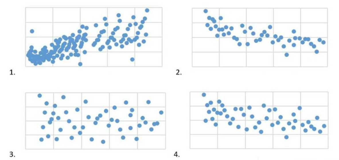
- A. 2
- B. 1
- C. 4
- D. 3
Answer:
C
Explanation:
Covariance measures the directional relationship between the returns on two assets. A positive
covariance means that asset returns move together while a negative covariance means they move
inversely. Zero covariance indicates that the returns on the two assets move independently of each
other. In the context of a scatter plot, zero covariance is represented by a plot where the points do
not show any upward or downward trend but are rather scattered randomly on the graph with no
discernible pattern.
Graph 4 displays such a pattern where there is no apparent relationship between the variables on the
x and y axes, indicating that there is zero covariance between them.
Reference: The IIBA®-CBDA certification material covers the understanding of statistical measures
such as covariance under the competency of Data Analysis and Interpretation. The relationship
between covariance and scatter plots is typically included in the essential reading resources for the
CBDA certification, such as texts on statistical analysis and data interpretation.
Question 2
An analyst is doing a clinical study on the value of analyte among a large population of healthy
people. The analyst is going to use a Gaussian Distribution to share the results. Which of the
following represents a Gaussian Distribution?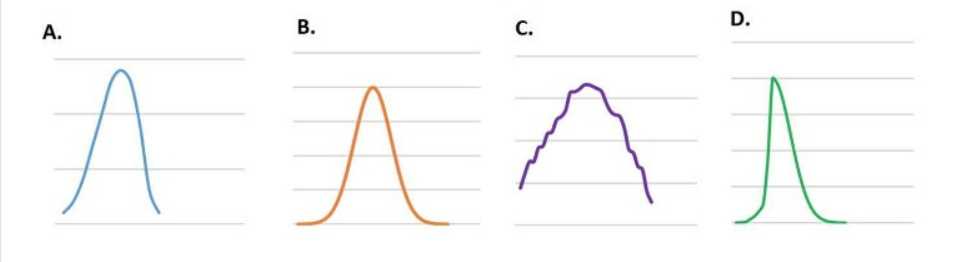
- A. D
- B. A
- C. C
- D. B
Answer:
B
Explanation:
The Gaussian distribution, also known as the normal distribution, is a probability distribution that is
symmetric about the mean, showing that data near the mean are more frequent in occurrence than
data far from the mean. In graph form, the Gaussian distribution will appear as a bell curve, which is
the case with option A. It is characterized by its bell-shaped curve and is defined by the mean (μ) and
the standard deviation (σ). It is a common assumption for the distribution of independent, randomly
generated variables.
Reference: The competencies required for the IIBA®-CBDA certification include understanding and
applying a range of business analysis and data analytics concepts, such as data analysis,
interpretation, and modeling, which includes the identification and application of appropriate
statistical distributions like the Gaussian distribution. This information can be found in the IIBA’s
Business Data Analytics guide within the essential reading resources for the CBDA certification.
Question 3
An analyst is working through data on comparing performance scores in different schools across the
state, for ranking purposes. Since there is a lot of data and some extreme outliers, the analyst is
trying to determine which type of statistical average would best represent the results. Which of the
following is a concern when relying too heavily on summary statistics during data analysis?
- A. Contextualization
- B. Data variation
- C. Data properties
- D. Frequency
Answer:
A
Explanation:
Summary statistics are numerical measures that describe certain characteristics of a data set, such as
the mean, median, mode, standard deviation, range, or quartiles. Summary statistics can help
simplify and communicate complex data, but they can also obscure or distort important information,
such as the distribution, shape, outliers, or trends of the data. Contextualization is the process of
providing relevant background information, assumptions, limitations, or explanations for the data
analysis and its results. Contextualization can help avoid misinterpretation, confusion, or bias when
using summary statistics. Contextualization can also help connect the data analysis to the business
problem, objectives, and stakeholders.
Reference:
Guide to Business Data Analytics
, page 43;
Introduction to Business Data Analytics: A
Practitioner View
, page 13.
Question 4
After completing their data analysis, an analyst is drawing out the results, explaining the methods
and processes used, and identifying any limitations or weaknesses in the data or methods applied.
While performing these steps, which recommended practice would the analyst apply?
- A. Use exploratory analysis to determine the best mathematical method to use
- B. Understand the communication needs of stakeholders
- C. Let the data drive the conclusions and the insights reached
- D. Learn a variety of visualization techniques for effective communications
Answer:
B
Explanation:
According to the IIBA® Guide to Business Data Analytics, communication is a key skill for analysts, as
it involves conveying the results, methods, and limitations of the data analysis to various
stakeholders in a clear, concise, and meaningful way. To communicate effectively, analysts need to
understand the communication needs of stakeholders, such as their level of interest, knowledge, and
influence, their preferred format and frequency of communication, and their expectations and
objectives. By understanding the communication needs of stakeholders, analysts can tailor their
messages, choose the appropriate language and tone, and select the most suitable communication
channels and medi
a. Therefore, the correct answer is B, as understanding the communication needs of stakeholders is a
recommended practice for analysts while performing the steps of drawing out the results, explaining
the methods and processes used, and identifying any limitations or weaknesses in the data or
methods applied.
Reference: : [IIBA® Guide to Business Data Analytics], Chapter 4: Business Data Analytics Techniques,
page 49, : [IIBA® Guide to Business Data Analytics], Chapter 5: Business Data Analytics
Competencies, page 63-64, : [IIBA® Guide to Business Data Analytics], Chapter 6: Business Data
Analytics Communication, page 71-72
Question 5
An analyst is performing regression analysis and reviewing the results. They would like to rescale the
variables in the model to more clearly reflect the relationship between the regression coefficients.
Which technique could be used to rescale the variables?
- A. Dimension Reduction
- B. Mean Centering
- C. Normalization
- D. Clustering
Answer:
C
Explanation:
Normalization is a technique that rescales the values of the variables in a data set to a common
range, such as [0,1] or [-1,1]. Normalization can help reduce the effect of outliers, improve the
performance of some algorithms, and make the interpretation of the regression coefficients easier
and more consistent. Normalization can be done using different methods, such as min-max scaling,
z-score scaling, or unit vector scaling.
Reference:
Guide to Business Data Analytics
, page 41;
Introduction to Business Data Analytics: A
Practitioner View
, page 12.
Question 6
A real estate broker is tracking monthly sales between two of its teams. The results have been
visualized using a Treemap chart. What is the advantage of using a Treemap chart, over a Sunburst
chart to visualize the results?
- A. With its colour scheme, it is easy to compare the variables within a Treemap
- B. With its rectangles and straight lines, a Treemap is optimized to include more
- C. A Treemap is meant to represent a hierarchical result set as opposed to a Sunburst chart
- D. A Treemap shows all the hierarchical levels of data as opposed to a Sunburst chart
Answer:
B
Explanation:
A Treemap chart is a type of chart that displays hierarchical data as a set of nested rectangles, where
the size and color of each rectangle represent a quantitative value and a categorical variable,
respectively1
.
A Sunburst chart is a type of chart that displays hierarchical data as a set of concentric
circles, where the size and color of each slice represent a quantitative value and a categorical
variable, respectively2
. Both charts are useful for visualizing hierarchical data structures, but they
have different advantages and disadvantages.
One advantage of using a Treemap chart over a
Sunburst chart is that a Treemap chart is optimized to include more data points, as it uses a Cartesian
coordinate system that fills the entire rectangular space of the chart area, whereas a Sunburst chart
uses a polar coordinate system that leaves empty spaces in the corners of the chart area3
. This
means that a Treemap chart can display more levels of hierarchy, more categories, and more details
than a Sunburst chart, without compromising readability or clarity.
Therefore, the correct answer is
B, as a Treemap chart is optimized to include more data than a Sunburst chart.
Reference:
:
Treemap Charts in Excel - Easy Excel Tutorial, 2
:
Sunburst Chart in Excel - Easy Excel
Tutorial, 3
:
Breaking down hierarchical data with Treemap and Sunburst charts | Microsoft 365 Blog
Question 7
A company wants to run a monthly promotion on batteries that cost 15 cents each and sells for 50
cents. At this price, they typically sell 1000 batteries and generate a profit of 35 cents per battery for
a total profit of $350. The analytics team was asked to test two price points - 20% off (i.e. a sale price
of 40 cents) and 40% off (i.e., a sale price of 30 cents). The survey data completed by 10000
participants was analyzed and showed that a 20% savings would result in sales of 1200 batteries and
the 40% savings would result in 1800 batteries being sold. The team's initial recommendation was to
recommend the 40% discount. Now that they are validating their recommendations, they decide to:
- A. Question why management would only want them to test two price points
- B. Change their recommendation realizing they have been victims of linear bias
- C. Redo the survey looking for a larger sample size
- D. Use their original recommendation given that the volume of sales is much higher
Answer:
B
Explanation:
Linear bias is a type of cognitive bias that assumes a linear relationship between two variables, when
in fact the relationship may be more complex or nonlinear. In this case, the analytics team assumed
that the higher the discount, the higher the sales and profit, without considering other factors that
may affect customer behavior, such as price elasticity, perceived quality, or competition. By changing
their recommendation, the team can avoid making a suboptimal decision that may result in lower
profit or customer satisfaction.
Reference:
10 Cognitive Biases in Business Analytics and How to Avoid Them
, page 5; [Business Data
Analytics: A Decision-Making Paradigm], page 9.
Question 8
While formulating the results from completed analysis, the analytics team is applying different
techniques to determine an optimal solution to the specified business problem. Which of the
following runs the risk of introducing bias in their decision making process?
- A. Evidenced-based decision making
- B. Expert judgement and experience
- C. Correlations identified through artificial intelligence
- D. Letting the data tell the story
Answer:
B
Explanation:
Expert judgement and experience are valuable sources of knowledge and insight for business data
analytics, but they can also introduce bias in the decision making process. Bias is a tendency to favor
or reject a certain perspective, outcome, or solution based on personal or subjective preferences,
beliefs, or expectations. Bias can affect the quality, validity, and reliability of the data analysis and the
resulting decisions. Some examples of bias that can affect expert judgement and experience are
confirmation bias, availability bias, anchoring bias, and overconfidence bias. To avoid or minimize
bias, business data analysts should apply critical thinking, data literacy, and ethical principles
throughout the data analysis process. They should also seek diverse perspectives, challenge
assumptions, validate findings, and communicate uncertainties and limitations.
Reference:
10 Cognitive Biases in Business Analytics and How to Avoid Them
;
Business Data
Analytics: A Decision-Making Paradigm
, page 8;
Guide to Business Data Analytics
, page 11.
Question 9
A consumer products company is interested in finding ways to innovate utilizing business analytics.
The team is reviewing a database of customer complaints. Interested in knowing how the
organization currently interacts with its customers, the analyst proposes the use of which technique?
- A. Document analysis
- B. Journey map
- C. Current state assessment
- D. Interface analysis
Answer:
B
Explanation:
A journey map is a visual representation of the interactions and experiences of a customer or
stakeholder with an organization, product, or service over time. A journey map can help identify pain
points, gaps, opportunities, and emotions along the customer journey. A journey map can also help
understand the current state of the customer experience and how it can be improved or innovated
using business analytics.
Reference:
Guide to Business Data Analytics
, page 55;
Introduction to Business Data Analytics: An
Organizational View
, page 18.
Question 10
A clinical research organization is using predictive analytics to improve patient safety and decrease
costs on its clinical trials. To ensure that a standard set of tools/techniques is identified and best
practices adhered to, teams are required to create scenarios to generate appropriate data for initial
analysis. This practice is required because it is almost certain that data will be difficult to come by for
most research. Which concern would lead the team to establish scenario development as a required
technique?
- A. Data validity
- B. Data privacy
- C. Data reliability
- D. Data reproducibility
Answer:
A
Explanation:
Data validity refers to the extent to which data accurately represents the phenomenon or concept
that it is intended to measure1
. Data validity is essential for predictive analytics, as it affects the
quality and credibility of the analysis results and the subsequent decisions or actions based on them.
If data is invalid, the predictions may be inaccurate, misleading, or irrelevant.
However, data validity
may be challenging to ensure in clinical research, as data may be scarce, incomplete, inconsistent, or
subject to errors or biases2
. Therefore, the team may establish scenario development as a required
technique to address this concern.
Scenario development is a form of document analysis that
involves creating hypothetical situations or stories based on assumptions, evidence, and logic to
explore the possible outcomes or implications of a problem or opportunity3
.
Scenario development
can help the team generate appropriate data for initial analysis by simulating different conditions,
variables, or events that may affect the clinical trials, and by testing the validity of the data against
the scenarios4.
Reference:
:
Validity in data collection methods - OpenLearn - Open University, 2
:
Data Quality in
Clinical Research - NCBI - NIH, 3
:
Scenario Analysis: How It Works and Examples -
Investopedia, 4
:
Predictive Analytics using simulation models - AnyLogic
Question 11
A large retail chain has asked their analytics team to complete a study on their customers' purchasing
patterns. The analyst assigned to the study has decided to draw further insight by grouping
customers based on their purchasing habits. This clustering approach is an example of:
- A. Untrained learning
- B. Trained learning
- C. Unsupervised learning
- D. Supervised learning
Answer:
C
Explanation:
Unsupervised learning is a category of data analysis techniques that does not require labeled data or
predefined outcomes. Unsupervised learning aims to discover patterns, structures, or relationships
in the data without any guidance or supervision. Clustering is a common example of unsupervised
learning, where the data is grouped into clusters based on some similarity or distance measure.
Clustering can help reveal customer segments, market trends, or product preferences, among other
insights.
Reference:
Guide to Business Data Analytics
, page 39;
Introduction to Business Data Analytics: A
Practitioner View
, page 10.
Question 12
An analyst is interested in determining whether their company is charging the right prices for their
products. Before creating a research question to frame their data analysis, they review a research
study provided by the sales department and review several competitor websites. Which statement is
true about document analysis?
- A. Documents that add the most value during document analysis are marketing studies
- B. Data mining is a form of document analysis
- C. Document analysis should be limited to proprietary sources
- D. Document analysis only involves reviewing physical documents
Answer:
B
Explanation:
Document analysis is a qualitative research technique that evaluates electronic and physical
documents to interpret them and gain an understanding of their meaning1
. It can be used to study
various types of documents, such as informal, external, or contextual documents, and to explore
their meanings, patterns, and themes.
Data mining is a form of document analysis that involves
applying statistical and computational methods to large datasets to discover hidden patterns, trends,
or relationships2
. Data mining can help analysts answer complex questions, generate hypotheses, or
support decision making.
Therefore, the correct answer is B, as data mining is a form of document
analysis.
Reference:
:
Document Analysis Guide: Definition and How To Perform It | Indeed.com, 2
:
Data
Mining - an overview | ScienceDirect Topics
Question 13
An analyst calculates the average, median, and mode values for a dataset. What type of analytics is
the analyst performing?
- A. Predictive
- B. Diagnostic
- C. Prescriptive
- D. Descriptive
Answer:
D
Explanation:
Descriptive analytics is the type of analytics that summarizes and visualizes data to provide an
overview of what has happened or is happening. Descriptive analytics uses techniques such as
statistics, charts, graphs, and dashboards to display data in an understandable and meaningful way.
Descriptive analytics can help analysts explore data, identify patterns, and communicate insights.
Calculating the average, median, and mode values for a dataset is an example of descriptive
analytics, as it provides a measure of central tendency for the data distribution. Reference:
Certification in Business Data Analytics (IIBA ® - CBDA)
, IIBA, accessed on January 20, 2024.
Business Data Analytics Certification - CBDA Competencies | IIBA®
, IIBA, accessed on January 20,
2024.
Guide to Business Data Analytics, IIBA, 2020, p. 15.
The 4 Types Of Analytics Explained (With Examples)
, Analytics for Decisions, accessed on January 20,
2024.
Question 14
The analytics team discovers there is an abundance of data available to them from various sources.
They are excited about the potential of turning this data into usable information for their
organization. They decide to focus the analytics work on:
- A. Using the data that is easiest to collect in order to turn out reports quickly
- B. Harnessing all the data and presenting various results to senior management
- C. Harnessing all the data as long as the analysis meets key cost criteria
- D. Using the data to answer a limited number of key questions
Answer:
D
Explanation:
According to the IIBA® Guide to Business Data Analytics, analytics work should be driven by well-
defined business problems or opportunities that are aligned with the organization’s strategic
objectives1
. Having an abundance of data does not necessarily mean that all of it is relevant, reliable,
or useful for the analytics purpose. Therefore, the analytics team should focus on using the data to
answer a limited number of key questions that are derived from the business context and that can
generate actionable insights and outcomes.
This approach can help the analytics team prioritize the
most important data sources, methods, and tools, as well as avoid wasting time and resources on
analysis that is not impactful or meaningful for the organization.
Reference:
:
IIBA® Guide to Business Data Analytics
, Chapter 3: Business Data Analytics Process,
page 24-25
Question 15
The results for a certification exam were revealed in percentage and percentile. How would you infer
the results for an attendee at: 75%, 90th percentile?
- A. While the attendee's exam score was 90/100. the attendee did better than 75% of the attendees
- B. While the attendee's exam score was 90/100. the attendee did better than 25% of the attendees
- C. While the attendee's exam score was 75/100. the attendee did better than 10% of the attendees
- D. While the attendee's exam score was 75/100. the attendee did better than 90% of the attendees
Answer:
D
Explanation:
A percentage is a way of expressing a number as a fraction of 100, while a percentile is a way of
expressing a number as a rank or position in a distribution of values. A percentage tells us how much
of something there is, while a percentile tells us how well something performed compared to others.
To infer the results for an attendee at 75%, 90th percentile, we need to understand what these two
numbers mean.
75% means that the attendee scored 75 out of 100 possible points on the exam. This is the absolute
score of the attendee, which does not depend on how others performed.
90th percentile means that the attendee scored higher than 90% of all the attendees who took the
exam. This is the relative score of the attendee, which depends on how others performed. For
example, if there were 1000 attendees, the 90th percentile would mean that the attendee scored
higher than 900 attendees, and lower than 100 attendees.
Therefore, the correct inference is that while the attendee’s exam score was 75/100, the attendee
did better than 90% of the attendees. This means that the attendee’s score was above average, and
that the exam was relatively difficult or had a low pass rate. Reference:
Difference Between Percentage and Percentile | Major Differences - BYJU’S
, BYJU’S, accessed on
January 20, 2024.
Difference Between Percentage and Percentile (with Examples and Comparison Chart) - Key
Differences
, Key Differences, accessed on January 20, 2024.
Certification in Business Data Analytics (IIBA ® - CBDA)
, IIBA, accessed on January 20, 2024.